Billions and Billions Served

Savvy marketers have known for decades about the power of social validation.

Photo credit: Ken Mayer

Any time you see or hear a line like “4 out of 5 doctors prefer…” or “10 million satisfied users can’t be wrong” you are being plied with social validation.

While going against the grain may be a good strategy for investing, when it comes to finding products and services to actually use, it often pays to follow the crowd.

When you pull into a restaurant parking lot and find that it’s empty, alarm bells should be going off. Either they are not serving yet, the food is terrible, the prices way too high or some other thing but if no one is eating there, you can be sure something is wrong.

With the explosion in smartphones, mobile communications and computer technology, crowdsourcing has taken off in a way that it never could before. Sites like Yelp enable users to post online reviews for all manner of products and/or services.

There are a bunch of terrific new apps coming out which take a slightly different twist on the concept. So let me list a few of my favorite crowd-enabled apps and websites.

1. Gas Buddy

This smartphone app, available for all smartphone platforms, will help you find the lowest gas prices within a 10 mile radius of your current location. Its millions of users are invited to report and update gas prices for any station they visit or pass. The app will tell you how recently prices for a given station were updated so you have some idea how accurate they are. You can also sort listings by distance or by price and even view stations on a map. This free app has saved me a bundle of money!

2. Waze

A GPS app that I’m absolutely in love with. It is available for iPhone, Android, Windows and Symbian. Beyond being merely a GPS with voice directions (by the way, the voice comes in your choice of both genders and over two dozen different languages!), Waze offers so much more. It alerts you when you are approaching traffic cameras, disabled vehicles, accidents, police speed traps, construction zones and so much more. It will even try to route you around these things whenever possible. Every Waze user is invited to submit reports of things that may affect driving conditions. Those reports are then sent to other nearby drivers who can corroborate or refute them.

You don’t even have to use Waze as a GPS. Simply turn it on when driving on familiar roads and leave it running in the background. It will not give you turn-by-turn directions (you don’t need them on familiar roads) but it will still warn you about road hazards ahead. This app saves me so much time and aggravation.

3. Indiegogo

This is really a website rather than an app. Its purpose is to enable small charitable fund drives, though there is no screening as for what constitutes a charitable cause. Users can request funds for anything they want from starting up a band to running a homeless shelter. You simply say how much money you want and what you intend to do with it. Others can decide for themselves whether or not they care to donate and how much to give. Users could give anything from a few cents to many thousands of dollars. It’s a great way to collect donations.

4. Quirky

A website that facilitates crowd-enabled inventing. Someone comes up with an idea for a new product and others can vote for it, thus endorsing it as a good idea, or even contribute refinements and improvements. Once an invention has been sufficiently refined and is deemed popular enough to be a likely commercial success, funders will help the inventor(s) bring it to market. Many extremely clever inventions that were developed in the Quirky community are also offered for sale on  Quirky’s website.

There are many other examples of ways in which technology is enabling the collective wisdom, observations and experiences of the larger community to improve the lives of all. Share your favorites below so everyone can benefit!

[contact-form][contact-field label=’Name’ type=’name’ required=’1’/][contact-field label=’Email’ type=’email’ required=’1’/][contact-field label=’Website or App’ type=’text’ required=’1’/][contact-field label=’Description of it’ type=’textarea’ required=’1’/][/contact-form]

6 Things You Probably Do Wrong With Mobile

Note: If you haven’t read the chapter from our book about Smartphones, you really should. This article builds on the information in that chapter.

It’s amazing how many companies get mobile wrong. Even very large, otherwise sophisticated companies.

For instance, I have an app from one of the largest banks in the world. About half the functionality is well designed and useful while the other half is simply awful. It’s so bad that I’m constantly tempted to just get rid of the app altogether.

There are a handful of things that companies regularly get wrong when designing mobile apps:

Photo courtesy of Cori Redfdord

1. Too Much Information

 TMI isn’t just about knowing that your mom was a party girl in her day. It’s vitally important to really consider how your mobile app will be used in the real world. Users will try to use it while walking down the street. Despite the stupidity of it (and laws against it), some will try to use it while driving. Even barring these, users are reading off a small screen.

In the name of all that is holy, you need to pare down the information you present to only that which is absolutely vital. If you hope to also keep it interesting and readable, you really need to hire a copywriter who excels in writing that is highly accessible, simple and interesting.

2. Too Many Steps

Hand-in-hand with too much information, many companies try to cram in far too much functionality. In the process, they create far too many steps to get any one thing done. People don’t want to climb the stairs. They want you to build them an escalator. Or better yet, a private elevator with a butler and someone to massage their feet and feed them grapes during their ride to the top.

How many is too many? Six steps may not seem like a lot, but it’s unquestionably too many in the world of apps. In fact, four is about the limit and you’d do far better sticking to three or less.

That’s why it’s so important to carefully plan what you want your app to do and get design input from both a copywriter and a designer. Or ideally, save yourself some money and hire someone who does both.

3. Hard to Navigate

Photo credit: J. Ronald Lee

If your app requires a user manual of any kind — even if they’re as simple as the assembly instructions for Ikea furniture — it is far too complex.

The most inexperienced user should be able to pick it up and make it do something useful with zero instruction. In fact, taken to its extreme, get a user who doesn’t speak or read English and see if he can navigate your app.

One of the things that frustrate me about several of the apps I use is that they send me “push” notifications. Even as a savvy computer user, I cannot figure out how to turn these off or change the settings for them. I’ve been backwards and forwards through these apps and they are simply a mystery.

It isn’t that you can’t adjust the settings, it’s that the adjustments are all so cumbersome and non-intuitive that I can’t figure them out.

4. Not Compelling

Even if your product or service interests me, if your app adds nothing to my life then why should I use it?

If all your app does is rehash and present information that’s easily obtainable from other sources, what is its purpose?

Don’t try to sell applesauce to an apple grower!

Even insurance companies, an industry known for being boring, make popular apps by adding utility to them. They let users keep policy information, offer checklists of things to do in an accident, give reminders… all sorts of helpful functions.

5. Resource Hog

Loads of video, huge pictures (remember, cell phone screens are small), the need to constantly be connected, large file or database sizes… all add to the “weight” of an app. You want your app to be a dainty preschool teacher, not a sumo wrestler.

Imagine an app that offers medical advice. I’m out hiking in the mountains and fall, suffering an injury. When I check the app for advice on treating my injuries I find that I must be online to get any useful information. Being in the mountains I have no signal. The app is useless to me.

The principle holds for almost any kind of app. If being connected to the internet is mandatory, you’ve just reduced the utility of the app considerably. If it takes up a lot of space on my phone, or if it runs slowly because it requires so much memory or other resources then I will hate it and will tell everyone I know how terrible it is.

6. Poor User Interface

Photo credit: Shawn Rossi

Look at your fingertip. Notice how large it is, relative to the size of your cell phone screen. If you make menu items too small or too close together, I will forever be clicking the wrong things.

Remember the game Operation? Now try playing that while holding the operating table in one hand and while walking down the hallway. If the guy’s nose lights up your whole company just lost the game.

Likewise if you include elements that are not resizable. I will grow frustrated.

Force me to conform to some predetermined path rather than just let me get to the information or functionality I want and I will definitely uninstall your app.

The Wrap-up

Remember, your app is like an employee. It represents your company. You wouldn’t tolerate an employee bad-mouthing the company to your customers. So don’t let your app do the same thing.

If you make a great app, word will spread and people will use it. Make a terrible app and be prepared to pay a terrible price.

While an average app may not generate the social media equivalent of hate mail or bad press, you won’t be doing yourself or your company any favors.

Hiring an expert to help you design and create your app is a small investment that will yield big benefits.


Click any of the icons below to retweet these passages from the above article.

Remember, we’ll donate money to charity for every retweet. No purchase necessary. You retweet, we donate. It’s that simple.

Retweet this passage 6 Things You Probably Do Wrong With Mobile

Retweet this passage It’s amazing how many companies get mobile wrong. Even large, sophisticated companies.

Retweet this passage A handful of things companies regularly get wrong when designing mobile apps.

Retweet this passage In the name of all that is holy, pare down the information!

Retweet this passage People don’t want to climb stairs. They want you to build an escalator. Or better yet…

Retweet this passage If your app requires a user manual of any kind, it is far too complex.

Retweet this passage Don’t try to sell applesauce to an apple grower!

Retweet this passage You want your app to be a dainty preschool teacher, not a sumo wrestler.

Retweet this passage Remember Operation? Try playing it while holding the operating table and walking.

Anti-selling

Much has been written about selling. That is, trying to get someone to do something: make a purchase or take some other action. Far less has been written about a completely different kind of selling: getting someone to not do something.

It’s the sort of thing that’s rarely attempted.

In 1971, Children’s Hospital of Pittsburgh created a cartoonish character named Mr. Yuk. The goal was to keep children away from household poisons.
Up until that time, the more or less universal symbol for poisons was the skull and crossbones. This had two major problems:

  1. The skull and crossbones is also recognized as the universal symbol for pirates. Pirates are appealing to children and are thought of romantically as daring, adventurous sorts. (That daring image is a double whammy, all but daring children to try the hazardous poisons they were supposed to be warning them away from.)
  2. The skull and crossbones was the team logo for a local Pittsburgh professional baseball team. This made the symbol doubly appealing to Pittsburgh children, especially those growing up in a household with sports fans.

The new symbol was developed by a pediatrician, based on careful research and study.

Although it’s still in use today, some subsequent studies have found that it may actually attract some children. Again, the very opposite of its intended effect.

On a much smaller scale, I recently noticed two clever attempts to ward freeloaders off from Wi-Fi hotspots. These were both personal, household internet connections. One was named “FBI Surveillance Van” and the other was named “5,000 Viruses”.

While neither of these is advertising in the strictest sense and both may just be manifestations of the owner’s sense of humor, I find them both clever and fitting with today’s topic.

In theory, convincing someone to not do something is no more difficult than convincing them to do something.

The primary difference I can think of is whether the message is something along the lines of “Go away and never come back” or something more like “Get away from this door but why don’t you go use that other door instead”? It could even be something like “This isn’t the right offer for you but it may be right for someone else”.

Those last two require establishing a fine balance where you ward people off without offending them. Hard stuff indeed.

Is it money well spent?

Let’s take a look at two examples of non-traditional advertising.

Both of these are real-life examples that I have personally seen in the area where I live. They are for different companies in completely different industries but that won’t matter for our purposes.

The first is a company that does heating and air conditioning service. They are large and well-known in our area.

The company has hired an airplane to fly around towing a large banner. The banner has the company’s logo and a short list of the three major services they offer.

That’s it.

No phone numbers, no email, no website, no address. No contact information of any kind. Just the logo and the short list of services.

The plane is sometimes up for hours at a time. Sue and I have seen it at least three times.

We both wonder if the owner of the company isn’t also the owner of the plane. And if he isn’t personally flying around getting some “free” advertising for his company since he’s up there flying anyway. That’s the only way this sort of advertising makes sense. Otherwise, it seems that the company is wasting an awful lot of money.

After all, who’s going to look up, see the banner and think “Hey I need to get my heater serviced. I think I’ll call those guys. Oh it’s okay that there’s no number, I’ll go out of my way to look it up. After all, they were so clever to have hired that airplane to buzz around towing that banner all day long.”

Yeah. It’s never going to happen.

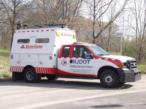
The second example I have is for a very well-known insurance company. They are a nationally recognized brand. The states in our area all have some variation on a “highway service patrol”.

They are called by different names but it’s basically a fleet of trucks owned and operated by the state Department of Transportation. The trucks carry gasoline, water, an air compressor, jumper cables and some tools for doing minor roadside repairs. When they find a motorist broken down by the side of the road, they stop and try to help.

In a couple of states, these vehicles are “sponsored” by this large insurance company. The company’s logo is displayed prominently on the trucks.

So prominently, in fact, that many motorists probably assume that the company owns and operates the trucks and that the trucks serve only policyholders for that company. It isn’t so but if you believe it is and are concerned about breaking down, it’s the sort of thing that might make you give added consideration to that company when deciding who to insure with.

So we have an HVAC service company being touted by a flying banner and an auto insurance company sponsoring highway repair vehicles.

There’s no apparent correlation between the first company and the type of advertising they are doing while a logical correlation exists between the second company and its advertising.

Must there be a correlation between the advertising you do and the product or service your company offers? Actually yes. You want your advertising efforts to reinforce the core offering of your company. In effect, the relationship between ad and service becomes a part of the advertising message itself.

Anything less is not money well spent.

$5 Million or 5 Daughters?

Photo credit: Janet McKnight

Asked, “Which would you rather have: $5 million or five daughters?”

Without hesitation, the man replied, “Five daughters.”

What?! Who in their right mind would choose such a thing?

A man who currently has eight daughters.

————

Okay, that was a humorous story but it makes an interesting point. The value we assign to most things is relative.

Diamonds and gold would likely have no value if you were stranded on a deserted island. In a deep flood, even a simple canoe will be more valuable than the most expensive luxury car.

Where am I going with this?

Once again, the answer isn’t entirely clear to me.

I heard the story about the five daughters and, aside from the humorous value, it triggered a cascade of semi-formed thoughts and ideas. This post is a partial exploration of those.

As a copywriter and a marketing consultant, understanding motivation is a crucial thing.

At its root, all motivation is based on value assessments. Given a choice between two things, people will generally choose the one which they believe will give them the most value.

However understanding the value that others place on objects and activities is a slippery slope. For instance, given a choice between watching TV or reading a book, most people will choose TV.

Why? I think just about everyone would agree that reading a book is intrinsically more valuable than watching TV. But that value comes at a price in terms of time and effort expended.

Suppose I offer to sell you an apple for $1 or a candy bar for $1. Those who place a very high value on health would be more likely to choose the apple while those who value pleasure would likely choose the chocolate.

Now suppose the apple were only ten cents but the candy bar was still $1.

If everyone presented with that deal had $1 and were willing to spend it all, the percentage of who chooses which option probably wouldn’t change much. A few who might otherwise have chosen the chocolate might now choose the apple if they value still having money left over, or if they were very hungry and could buy several apples rather than just one candy bar.

What if you had at least ten cents but far less than $1? You could buy the apple now or put in a hour’s work to earn enough to buy the chocolate. How many more would value the speed and convenience of the apple they can afford over the time and effort spent to get the chocolate they can’t?

This may seem a ridiculous example when we’re talking about small inexpensive items like apples and candy bars but what about the difference between two rather expensive and purely discretionary luxury items? Let’s say a jet ski or a motorcycle.

Assuming both were equally appealing, what would be the result of applying the exercises above?

More importantly to a marketer, how can I make my product seem more valuable than the alternative?


Click any of the links below to retweet these passages from the above article.

Remember, we’ll donate money to charity for every retweet. No purchase necessary. You retweet, we donate. It’s that simple.

Retweet this passage Which would you rather have: $5 million or five daughters?

Retweet this passage Who in their right mind would choose such a thing?

Retweet this passage The value we assign to most things is relative.

Retweet this passage In a flood, a canoe will be more valuable than the most expensive luxury car.

Retweet this passage Understanding motivation is a crucial thing.

Retweet this passage At its root, all motivation is based on value assessments.

Retweet this passage This may seem like a ridiculous example.

Retweet this passage How can I make my product seem more valuable than the alternative?